Tom Swarbrick 4pm - 6pm
2 April 2024, 07:31 | Updated: 2 April 2024, 07:36

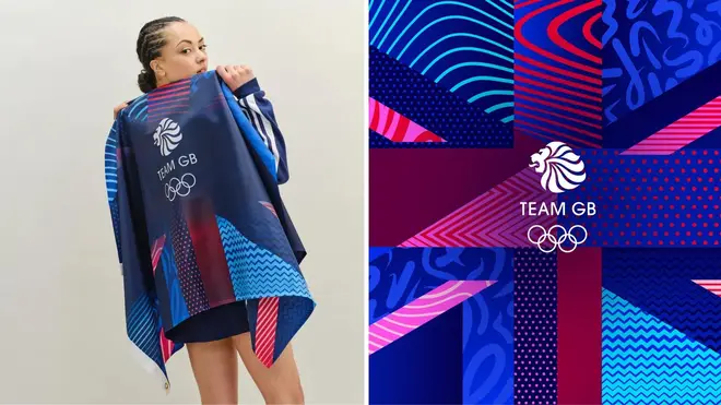
Sports fans have hit out at Team GB over a redesign of the Union Jack in pink and purple ahead of the Paris Olympics.
Designers for Team GB updated the Union Jack as they said in a statement on their website while the colours were “synonymous with Great Britain” they were “far from unique”.
The designers, from the Bath-based agency Thisaway, said they needed to find a way to “refresh” the colour palette.
But the move has been met with furious backlash after a similar row broke out over England’s new kit for the Euros 2024.
Nike revealed it had altered the cross using purple and blue horizontal stripes in what it called a "playful update" to the shirt.
The Team GB redesign is aimed to appeal to a “new generation of sports fans", designers said.
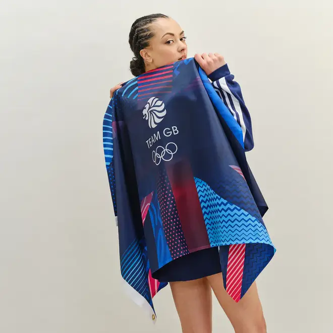
The flag colours have been changed on the “Supporters Flags” which are available for £12 on the Team GB shop ahead of this year’s Paris Olympics.
However, it has already faced fierce backlash, including from former England goalkeeper Peter Shilton CBE who expressed his disappointment over the design change.
He told The Sun: “I’m totally against any change to our national flag.
"It feels that nothing is held sacred these days in the UK. Our national flag has been symbolic for many years and should never be changed.”
Read more: ‘It was never our intention to offend’: Nike defends change to St George’s Cross on new England Kit
Read more: Keir Starmer calls for Nike to scrap England football kit with 'updated' St George's Cross

The full statement on the Thisaway website reads: “As with many sport brands, colour was a point of contention. Obviously red, white and blue is synonymous with Great Britain, but it's far from unique, with other competing nations such as France and USA also sporting the same colours.
“We needed to find a way of refreshing Team GB's colour palette in a way that is both flexible and ownable.
“Rather than trying to look beyond the traditional colours, we decided to embrace them and push the iconic red white and blue as far as we could.
“The result is a vibrant and varied colour palette that has the versatility to be restrained and traditional in one breath, and bold and contemporary in the next.
“The core palette is also complimented by the three other colours that go hand-in-hand with the Olympic Games; gold silver and bronze.”
Malcolm Farrow, president of the Flag Institute said the redesign had ‘defaced’ the emblem.
He said: “I don’t approve of our national symbol of unity being defaced.
“People have every right to be upset with Team GB. They need to remember brave men fought for this flag and died while protecting it. Changing it is bordering on an insult to them.
“To do something like this in places like India, Greece or Turkey would have serious consequences.
“Designs to commemorate special events like previous Olympics have put an approved badge in the centre and kept the flag the same. This is just a marketing gimmick.”
Team GB said they had received “very positive feedback” from members of the public over the design change.
They added: “Rest assured the Union Flag will feature proudly on the team kit for Paris, as it always does. This image doesn’t replace the Union Flag, which we will wear with pride later this summer.”